


Appearance Theme
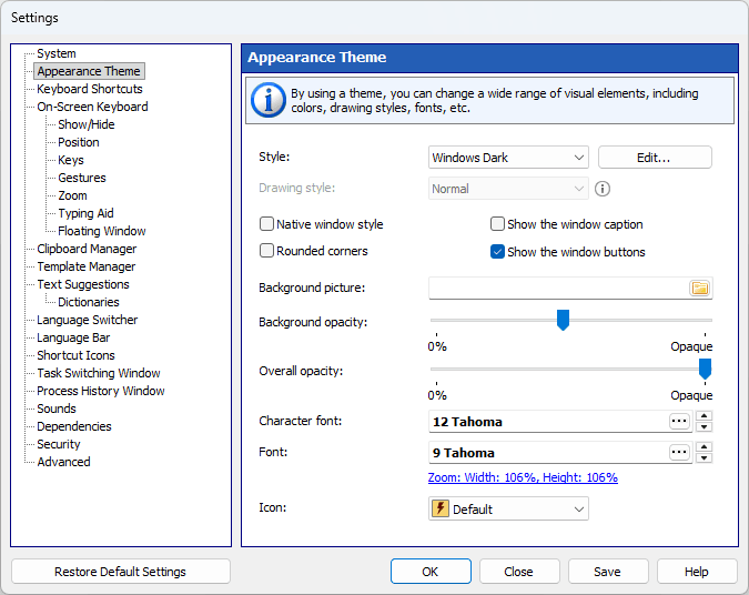
By using a theme, you can change a wide range of visual elements: the colors and the pictures of the keys, the fonts, the roundness of the keys and the thickness of their border.
Style
A color scheme.
Use the three buttons next to the list to manage styles: “Add” creates a new style from the colors of the current one and opens it in the “Color / Picture” window, “Edit” opens the “Color / Picture” window for the selected style, and “Delete” removes a style of your own. The styles supplied with the program are never overwritten: as soon as you change one of them, a copy of your own is created.
In the “Color / Picture” window every color has its own drop-down picker. The rows are the parts of a key (“Key”, “Key border”, “Characters” and “Key labels”), and the columns are the key states, with separate columns for “Function keys” and “Control keys”. The picture of a key is selected in the same window, separately for regular, function and control keys.
Key states:
| • | Normal – The key in its normal state |
| • | Hover – The highlighted key, when the mouse pointer hovers over it |
| • | Pressed – The key when pressed |
Roundness
This slider sets the corner radius of the keys, from square keys on the left to fully round ones on the right.
Border thickness
The thickness of the border drawn around every key, from 0 to 9. The border is drawn inward, so the keys keep their size.
Background picture
You can select an image file (for example, a photo) to be used for the background. To remove the background image, simply clear the filename in the text field.
Background transparency
You can adjust the transparency of the background.
Overall transparency
You can adjust the transparency of all window elements, except for the background.
Character font
The font for characters displayed on the on-screen keyboard.
Font
The main font for visible window elements.
Zoom
The width of the on-screen keyboard as a percentage of its original size. The same value can be set on the “Zoom” page, where the height can be changed as well. The slider is hidden while “Fit width” or “Fit height” is on.
Color keys by finger zone
You can highlight keys to learn touch typing. The keys will be highlighted in a different color for each finger.
Show the on-screen keyboard in the Windows style
Check this checkbox to make the on-screen keyboard use the native Windows style instead of the colors of the selected style.
Show the window caption
Check this checkbox to increase the visible area under the semitransparent background. If the caption is hidden, you can move the window by clicking anywhere on its background.
Show the window buttons
Use this option together with “Show the window caption” to increase the visible area.